Educational Institution Visual Identity
A student redesign concept for the Queen Rania Foundation
Overview
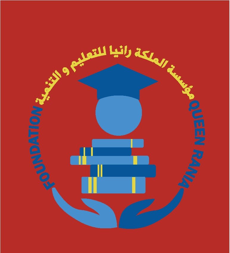
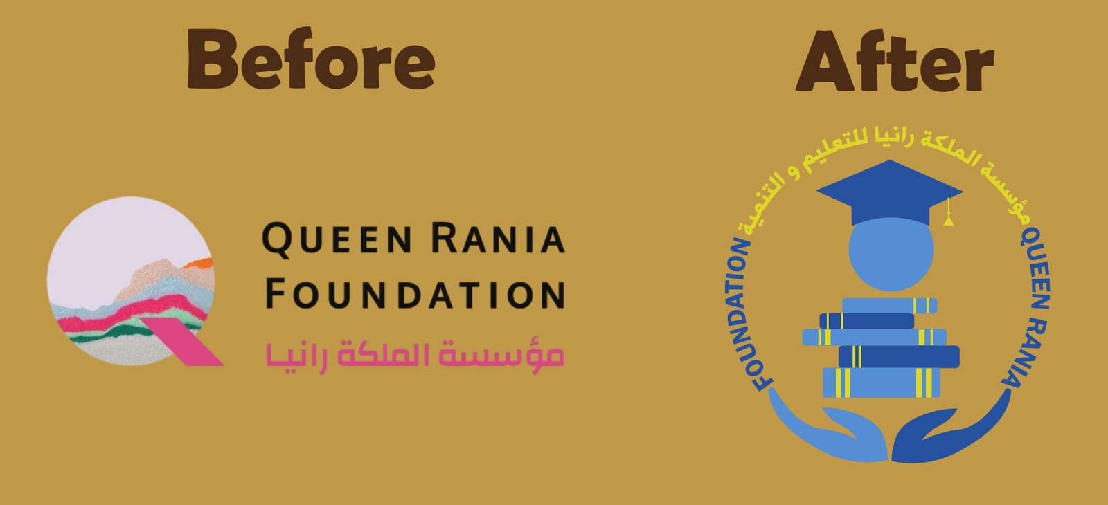
For this coursework project I redesigned the mark of the Queen Rania Foundation for Education and Development. The brief I set myself: keep the humanitarian purpose of the original front and center while giving it a cleaner, more contemporary circular emblem.
Design concept
The mark was founded on a humanitarian purpose: improving the quality of education and developing children's abilities to think creatively. Its philosophy is expressed through simplicity — every element speaks plainly about care, nurturing and learning.
Symbol meanings

Child in a graduation cap
Advancement through education, reflecting the institution's mission.

Stacked books
Scientific diversity and integration achieved through high-quality education.

Open hands
Care and attention, central to the institution's focus on raising education quality.
Usage rules
- Do not change the approved logo colors.
- Do not tilt or slant the logo.
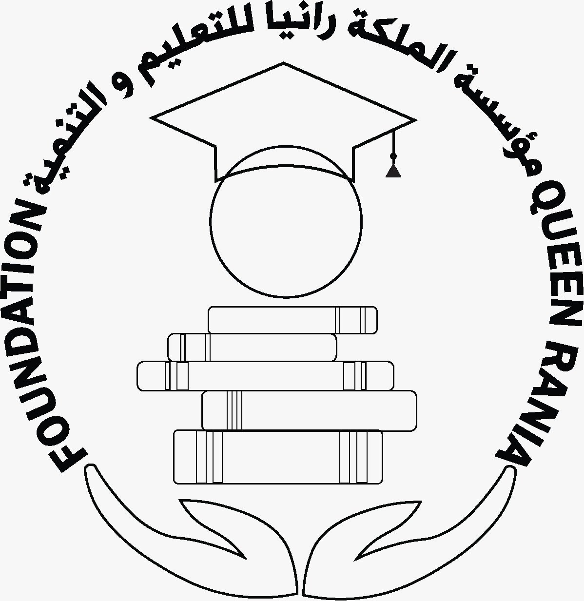
- Do not hollow out or outline the logo.
- Do not add extra text or typography onto the logo.
- Do not add effects, patterns or place it on unapproved background colors.
- Always maintain the logo's safe clear space.